The Solution
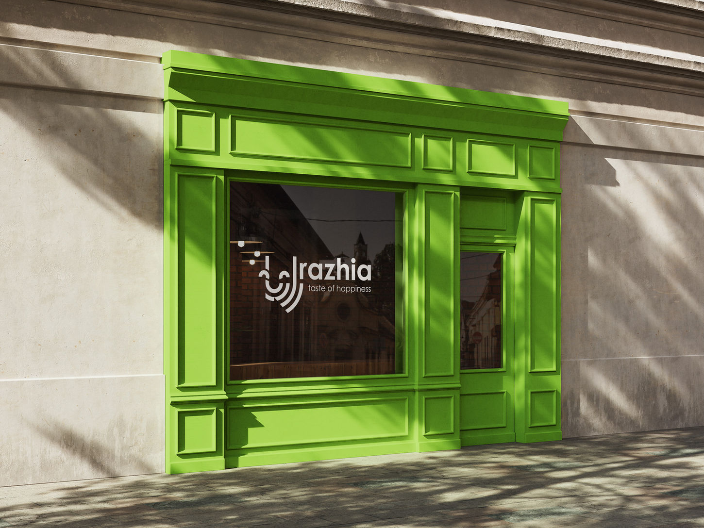
The logo design features a joyful, smiling face to evoke warmth and positivity, complemented by a green color palette that emphasizes health and freshness. The dark green curved forms subtly spell out “Razhia” in Farsi, anchoring the brand in its cultural roots. Four distinct packaging designs were developed for each sandwich variety, using bold colour blocks and minimal illustrations inspired by the ingredients. The final identity is vibrant, modern, and playful — visually aligned with the brand’s promise of feel-good, health-conscious food.
The packaging design is intentionally minimal, letting colour and form do the talking. Each variety is differentiated by its own bold colour and simple shapes inspired by the ingredients inside. The result is fresh, modern, and visually uplifting — just like the product itself.
The Brief
Razhia is a health-focused food brand built around the tagline “Taste of Happiness.” The client needed a brand identity that would reflect joy, freshness, and cultural authenticity — while also standing out on the shelf in a crowded market. The identity needed to be versatile enough to carry across packaging, digital content, and future product extensions.
Razhia
Brand Visual Identity | Packaging
2019
Razhia is a health-focused food brand built around the tagline “Taste of Happiness.”


